

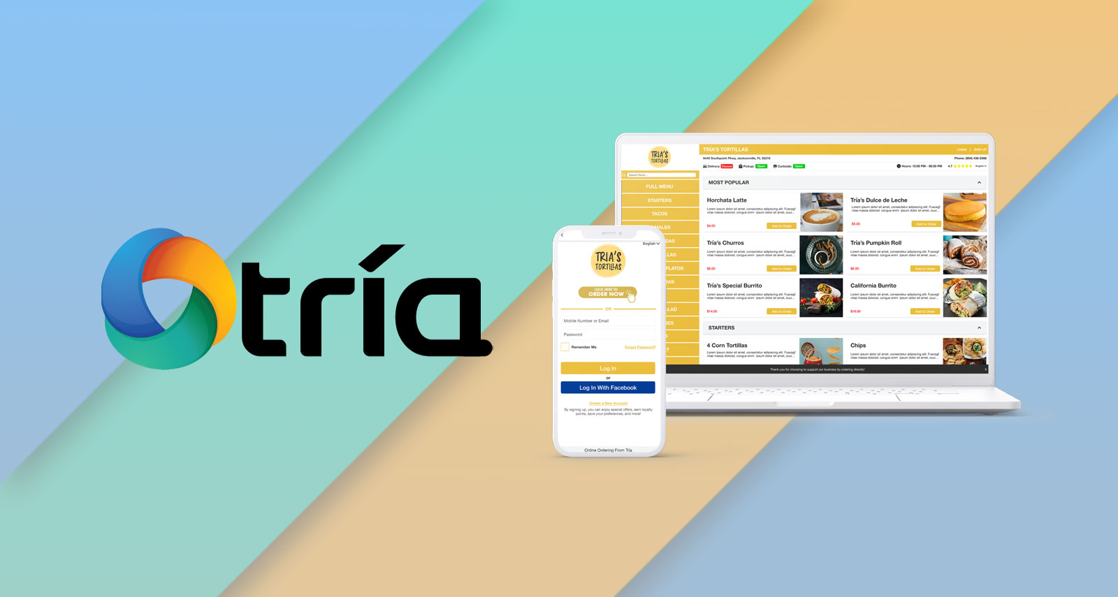
Tria
ONLINE ORDERING IS JUST THE BEGINNING
Tria
ONLINE ORDERING IS JUST THE BEGINNING
Project Overview
Tria is an online ordering platform that restaurant owners would sign up for in order to be able to take online orders. Once a restaurant owner signed up, the team at Tria would use the Tria platform to add all of the menu items and configure various settings for the restaurant such as hours, menu categories, and ordering methods available. When this was completed, customers could go to the restaurant’s unique URL, browse their menu, and place orders for pickup, delivery, dine-in, and/or curbside.
I was brought on to refresh Tria’s UI and look for ways to make a better user experience for customers who used the platform. Much of the dissatisfaction from customers, merchants, and the team at Tria involved the UI I completely revamped the entire front-end experience from signing up for an account on Tria to ordering food. The design I worked on also translated well to mobile devices. Tria was originally only created for the web so many complaints came from mobile users who were ordering from these restaurants on their mobile devices.
Project Details
Duration: 2 Months
Team: 1 Product Designer (myself), Multiple Software Developers
My Role: UX Researcher, UX/UI Designer, Interaction Designer, QC
Tools: XD, Photoshop, Brackets, Trello
Deliverables: Web App
The Challenge
How can the Tria user interface be redesigned to the level of its major competitors while also incorporating a brand-new mobile experience?
How can the Tria user interface be redesigned to the level of its major competitors while also incorporating a brand-new mobile experience?
Tria UI Design
Background
The team at Tria wanted more from how their online ordering looked especially compared to their competitors. The original design was not completed by a professional designer and was largely rushed with little QA testing regarding functionality. Some complaints included the images not being proportionate to one another, customers getting confused during the checkout process, and the app is very difficult to use on mobile devices. These complaints were echoed by the team at Tria, the merchants who signed up for the service, and the customers of the merchants who used the service to make orders.
Due to time constraints, only the most problematic areas were completely redesigned (menu, food items, checkout). Some of the more general sections (customer profile, login page, privacy policy page, etc…) of the front end only had some spacing and typography updates. My goal was to make the largest impact on the user experience as I could within my given time frame. I wanted to provide the user with all of the information they needed to make a decision about their order but in a UI that wouldn’t be as tiresome as the current design.
The finished design exceeded the expectations of the Tria team and made the ordering process much smoother. The confusion during the checkout process was eliminated and overall, the app was able to stand toe to toe with the large competitors Tria was taking on. I also went on to create the website for Tria based on this work.
Process
Research Phase
Before beginning the redesign, I sat down with the team at Tria to fully understand what they didn’t like about the current design and if there was anything that they’ve seen that they did like. Much of their feedback came from the merchants and customers of the merchants who used Tria. There would often be bug reports submitted to the Tria team because users mistake the functionality for a bug. After researching some of the competitors together, they had a general idea of what they wanted to the interface to look like. In fact, they even had a specific competitor design that they wanted Tria to be modeled after.
It’s great the client knew exactly what they wanted the design to look like, but they risked falling back into the trap of a poor UX without the discovery and prototyping needed to test their requested changes. I aimed to accommodate the design while providing UX feedback where necessary. After meeting with the Tria team, a list was created to help address some of the pain areas which I used to help keep me on track while going through each of the pages.
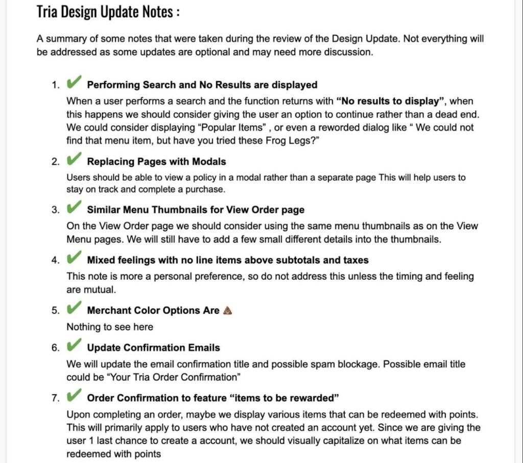
(Tria design update notes)
Design Phase
I took a systematic approach to redesigning each of the pages by taking screenshots of every front-end page of the app. I ensured the new design touched every aspect of the app including small things like checkboxes and modals. In all, there were about 32 pages that needed to be addressed. I then began laying out the new designs 1 for 1, next to the existing 32 pages. I used this same method when doing the mobile layout.
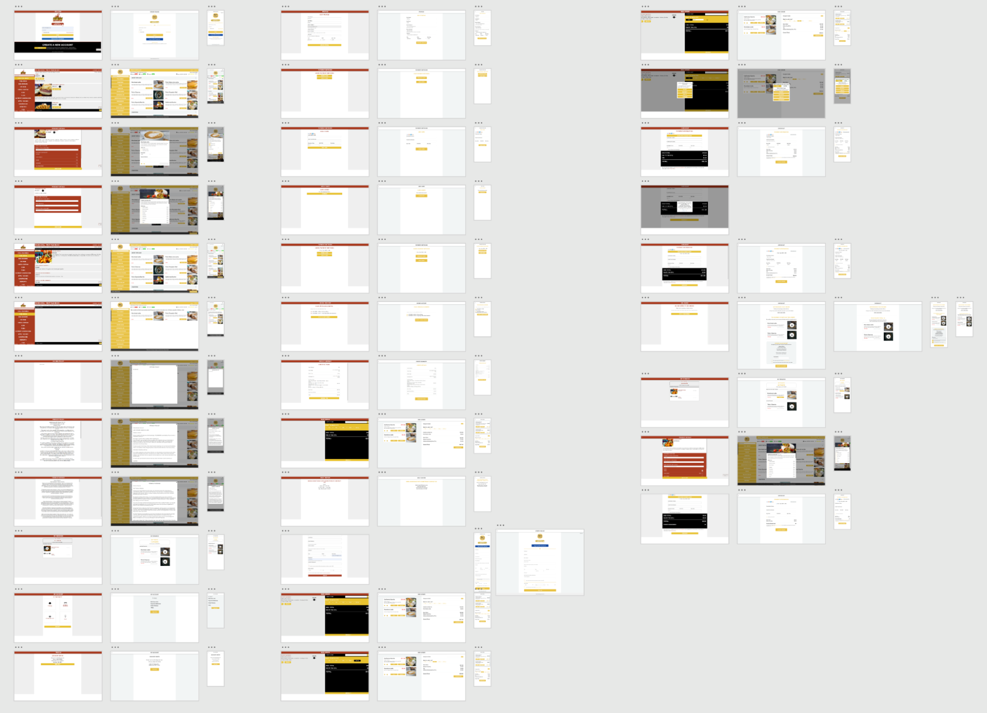
(Tria before and after artboards)
Once the new artboards were worked out, I began running through different prototyping paths to ensure the new design would accommodate the various checkout methods the customer may encounter.
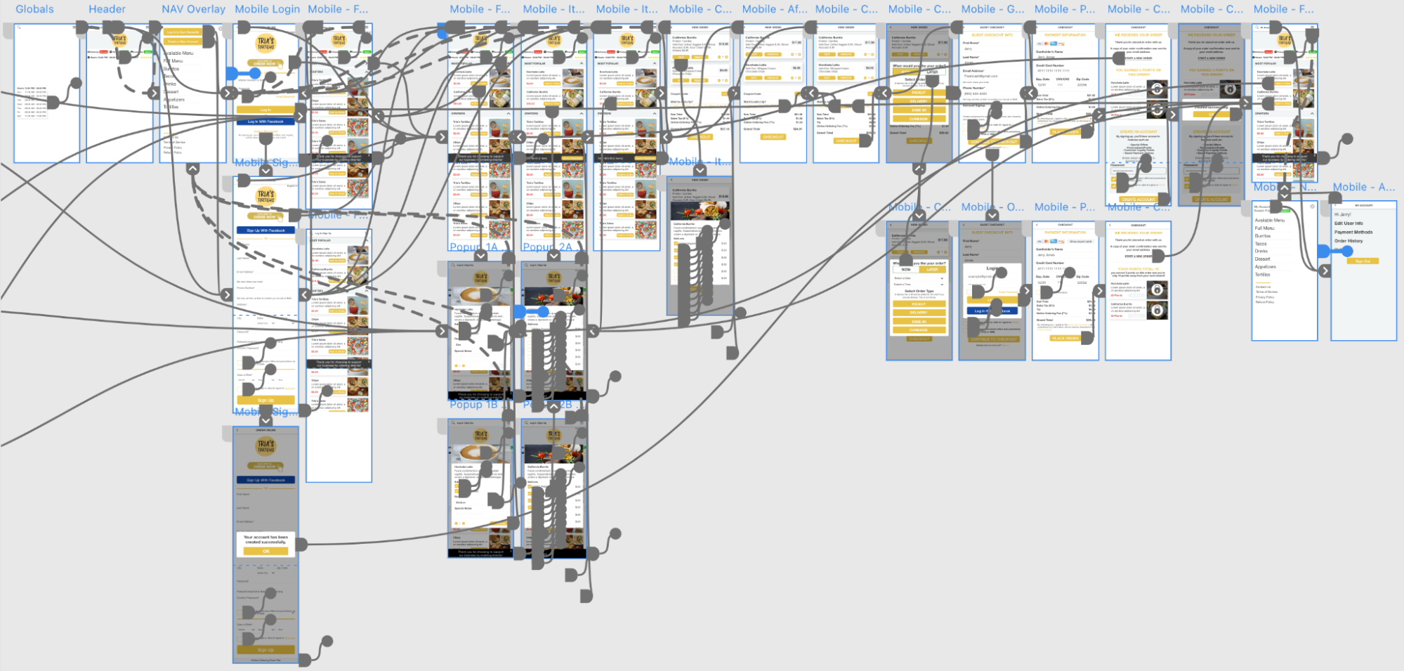
(prototyping paths for Tria mobile)
Testing Phase
When going through the design with the development team, there were some minor adjustments that needed to be made to accommodate how some of the new front-end features would work. For instance, the new design included a status to indicate if a business was open for delivery, pickup, and curbside ordering.
While on the back end, merchants could specify their overall business hours, there was no way for them to define specific hours for each of their ordering types. This wasn’t a big issue, but just required additional attention to be paid to how some of these new features were going to be implemented.
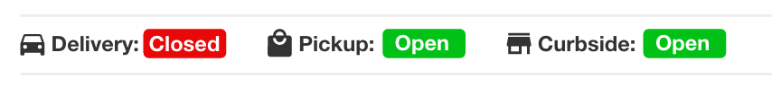
(restaurant status bar)
One continual cause of headaches was scheduling orders in advance. In the old design, the UI made it difficult to understand how to schedule an order. Users would often call the merchant and complain that they could not schedule an order and the merchant would then call the Tria team to let them know customers weren’t able to access order scheduling. This issue was actually caused because the scheduling options were tucked away in a not-so-obvious dropdown. With the new design, it was very clear if your order was for a present or future time.
Instead of having a clock icon with an arrow pointing down that users needed to click on, they would see a section labeled ‘LATER’ that they could click on where they would be able to define the day and time for their order. The new design completely eliminated inquiries related to this issue.
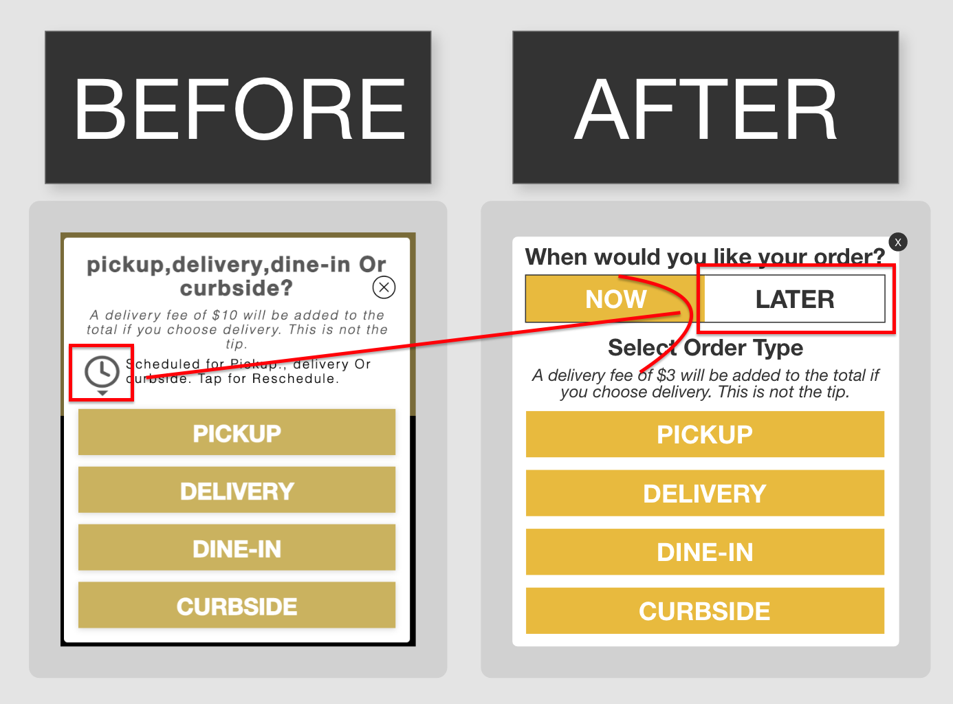
(ordering modal before and after)
Testing went very well with the general consensus that the new design was going to make a significant positive impact.
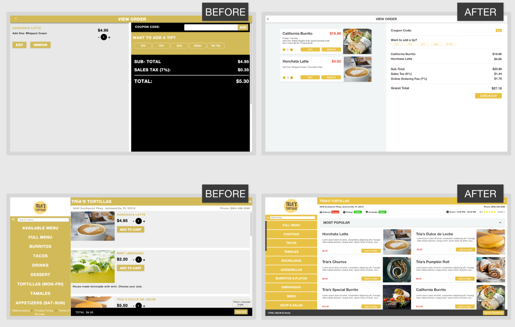
(checkout screen and menu UI before and after)
Final Designs
New Mobile UI
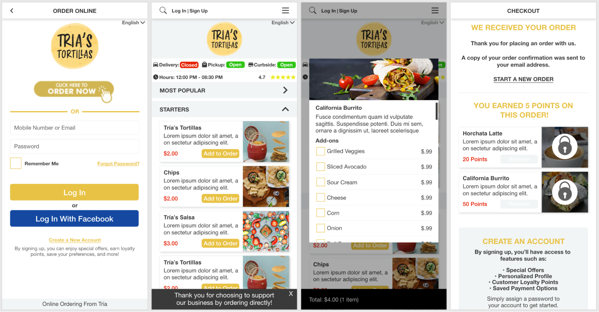
The new design was uploaded to test servers and shared with the Tria team where it was received very well. The mobile version was a huge improvement and really enhanced the user experience for customers ordering on their phones
Conclusion
Impact
Overall, the user experience was greatly improved and the new design made it much more enticing for restaurant owners who were interested in online ordering through Tria. Tria could be demoed in confidence by the sales team who were now convinced they had a superior product than their competitors.
The new UI made navigating Trias online menus much easier for customers. The updated design allowed more menu items to be shown without scrolling, categories within the menu to be collapsed so users could see more of what they wanted, and popular dishes (based on the restaurant’s actual top-selling dishes) to display in place of no search results, menu item editing while checking out, and much more.
What I Learned
The team at Tria largely knew what they were looking for in a new design. While this made achieving their desired results easier, it left less opportunity for me to lend my expertise in various scenarios. I learned that it’s important to approach situations like this in the future by setting the expectations up front that some of the expected design may need to be adjusted to account for the user experience.
Doing this midway through the design process caused more pushback from the team because they didn’t anticipate how some of their specific design requests would impact the user experience.
Next Steps
After completing the new UI for Tria, I also created the website and worked on several new feature requests for Tria. These included an ID upload feature for alcohol sales, a status indicator on the back end for merchants reviewing orders, and an overhaul of merchant settings.