
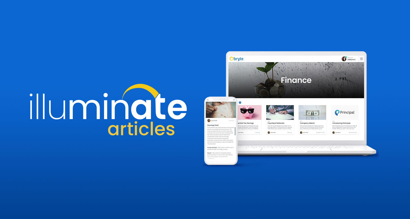
Illuminate – Articles
KEEP YOUR TEAM INFORMED AND INSPIRED
Illuminate – Articles
KEEP YOUR TEAM INFORMED AND INSPIRED
Project Overview
Illuminate was developed as a multi-module HR application designed to empower employees within their workplace. This module (Illuminate – Articles) was created to serve several purposes, but mainly as a way for managers to share important company information with employees. This information ranged from upcoming company events to benefits information and paystub links.
I was the lead designer on this project and completed the research, prototyping, and design, and communicated with the development team.
Project Details
Duration: 1-2 Months
Team: 2 Product Designers (myself), Multiple Software Developers
My Role: UX Architect, UX Researcher, UX/UI Designer, Interaction Designer, UX Writer, QC
Tools: XD, Trello
Deliverables: Web App Module
The Challenge
How can we allow managers to communicate company updates and important company information to their employees?
How can we allow managers to communicate company updates and important company information to their employees?
Introducing Illuminate – Articles
Background
Illuminate – Articles was created for Bryte Payment Solutions, a payment processing company with an assortment of applications designed and maintained in-house. It was built as the second module of many that would make up Illuminate, a full-service HR application with the goal of organically bridging the gap between real life and work.
After my team and I designed the Illuminate dashboards and the time tracker module (learn more about this here), I took the lead on solving our next problem. I wanted to provide companies with a way to share important information, documents, and links with their employees and after exploring various solutions, I landed on the Articles feature.
This feature allowed managers to create articles in the backend dashboard that once published, appeared in a section on the employee dashboard. This meant employees could now access company benefits, finance, and wellness information all through their dashboards. Best of all, Articles were designed to accommodate various use cases. Along with organizing company content for employees to access, managers could give updates about Covid-19, create help articles for new employees, send out notices about company events, and more.
Process
Research Phase
When my team and I first designed the employee facing dashboard for Illuminate, we included a section in the hero that would update with company announcements for employees. However, at that point, we hadn’t fully worked out the functionality of this feature. Once I began ideating solutions for the Announcements feature, I landed on an opportunity to accommodate some of the other employee dashboard sections that still needed to be created (Benefits, Finance, Wellness).
The problem I was trying to solve was not unique to Illuminate, so I did some research into how other companies handled conveying information to their employees through a portal. One competitor had a page full of tiles, each with its own list of links that once clicked on, would open a modal.
(early dashboard concept with announcements)
(competitor information section)
While I liked the concept, the UI felt very cluttered once several tiles with various links were added to the page. I also felt the modal was a bit uninspiring and wouldn’t be able to hold a user’s interest. During my ideation, it was important to consider how managers were going to post new information, not just how it would look to employees. I considered numerous scenarios to help me define the functionality of creating and posting articles such as:
- How will articles be organized?
- How could managers prioritize their most important articles on a page?
- What if the information in an article is urgent? How could we get the employee’s attention?
- If the manager is working on an article but isn’t ready for it to go live, how can we accommodate that?
Each of these questions led me to a design inspired by my research and the previous work we completed on Illuminate – Time Tracker.
Design Phase
A large portion of our research went into the state and federal labor laws that our app would need to accommodate. Weeks of discovery went into overtime laws, pay periods, pay weeks, employment types, and much more. We needed to allow the most flexibility within our settings for businesses working under different state and local laws. There were also certain user behaviors we needed to anticipate and develop solutions for. For example, if a user clocked in at 8 AM and then forgot to clock out that day, how would the system handle this occurrence especially when they tried to clock in for their shift that next morning? Our final design was intuitive enough to address such scenarios while also improving on existing competitor solutions.
I started on the layout and design of the Articles from the employee’s point of view. I did it in this order because I didn’t want the employee-facing UI to be hindered by the Article creation UI. I was really satisfied with the way we handled displaying employee shifts during Illuminate – Time Tracker development, so I opted to leverage a similar card design. I felt the cards would allow for a clean and straightforward UI that would keep the design consistent throughout Illuminate as a whole. I liked the idea that managers who have experience with the time cards would feel the Articles had a naturalness to them.
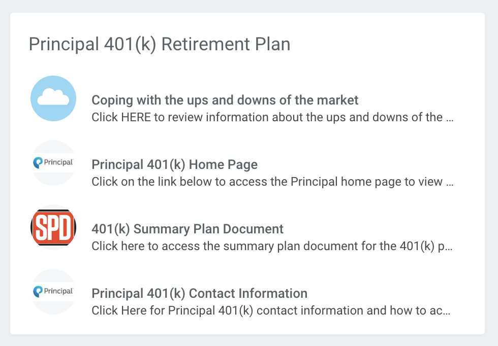
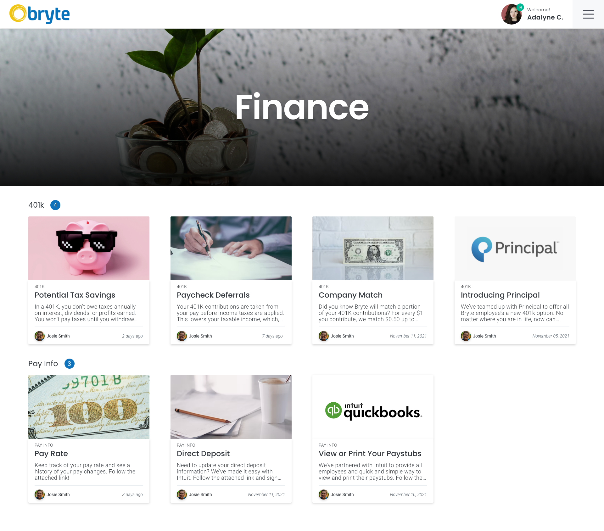
As far as the user flow went, I didn’t want employees to get lost in menus or page taxonomies considering managers would be able to categorize their Articles. This is what the user flow would look like for employees learning about a 401K benefit from their employer:
- An employee logs into their dashboard and selects ‘401K’ under the ‘Finance’ section
- The employee is taken to the ‘401K’ category of the ‘Finance’ section
- The employee can now click on one of the 401K Article Cards
- The employee can also go to the main Finance page which displays all of the Finance categories
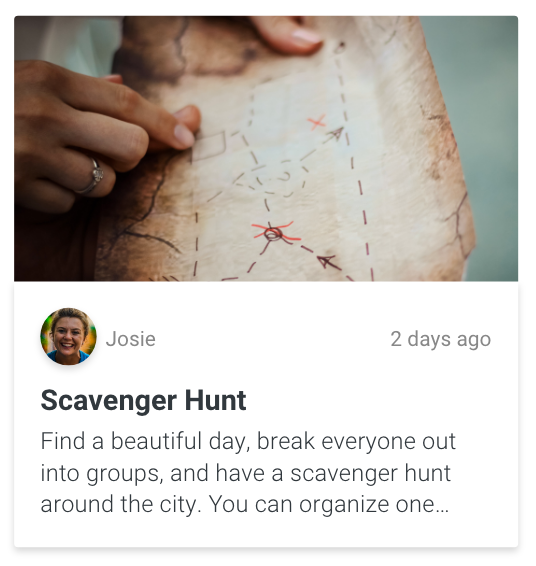
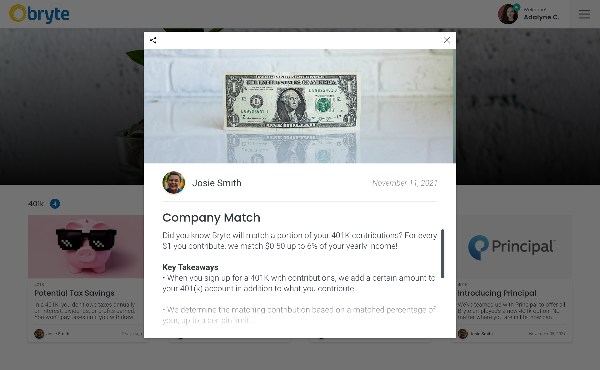
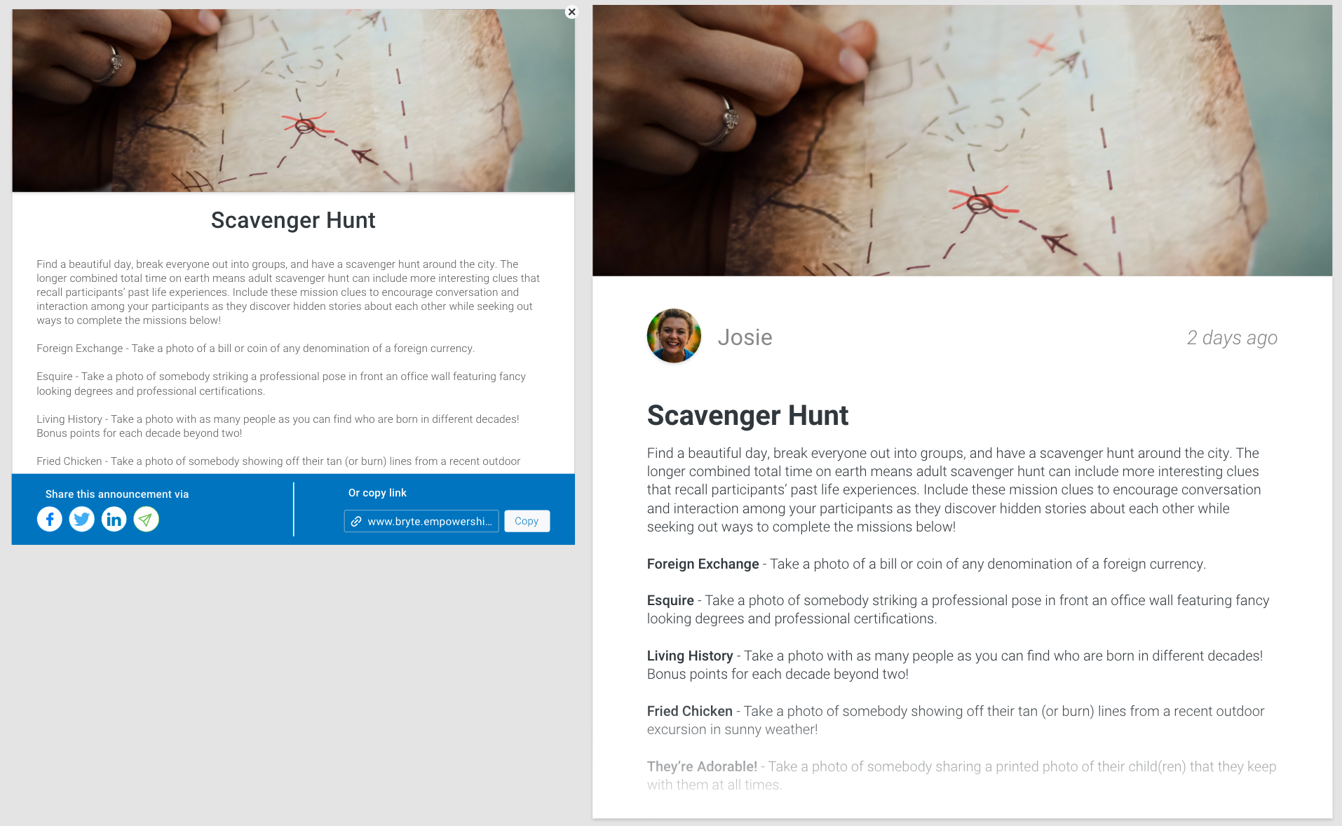
(article card)
With the employee-facing side designed, I now knew what I would need to include for the managers who would be creating and posting the Articles. I leveraged the navigation to direct users to the section they wanted to include articles for. Along with a title and body, I allowed the user to select the author, category (including adding new ones), publish date, and options to notify employees, hide articles from the employee, and pin articles for the employee.
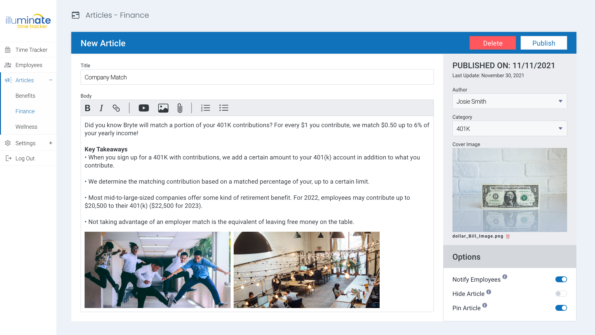
(article creation interface)
Testing Phase
The design of Illuminate – Articles faced many iterations based on feedback from in-house testing and internal review with my team. For instance, the Article modals went through different design revisions in the early mockups that simplified the UI while providing the user with insights they may find valuable (author, date).
(articles early design vs final design)
Final Design
Web App Employee View
The design for Illuminate – Articles was completed for web and mobile and it is currently pending development as part of Illuminate.
Conclusion
Impact
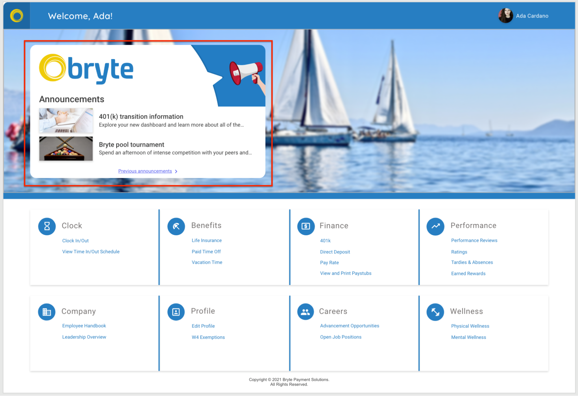
Illuminate – Articles considerably reduced the development time needed for some of the other sections of Illuminate. It provided the tools needed to populate the Finance, Benefits, and Wellness sections and was also used as a solution for an announcements feature that was designed later.
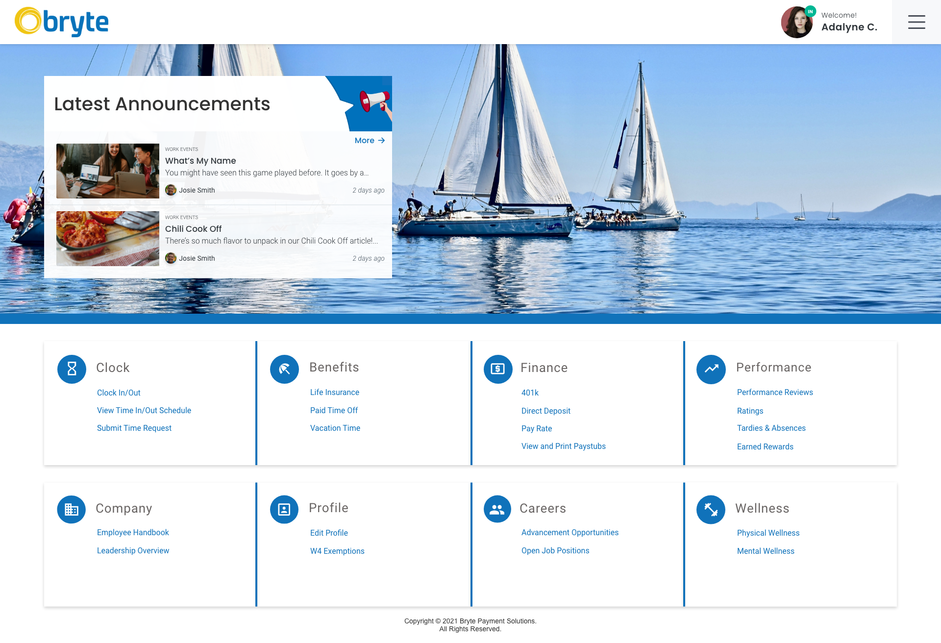
(dashboard with latest announcements)
What I Learned
Working on Illuminate – Articles, I learned a lot about the iteration process. It’s easy to get caught up in a particular design without considering other variations that may lead to a better user experience. Conducting design reviews with my team, I really got to understand the value of a fresh perspective. My design mentor actually taught me a really great technique that I use on almost every new project I work on.
During the iteration process, start with 3 UI deviations; one slightly different than your original design, one moderately different than your original design, and one completely different than your original design. This technique really helped me to establish which components were most important in my design. It also helped me to visualize other design possibilities that I otherwise may not have considered.
Next Steps
With the previous development of the Time Tracker module (which also included the complete UI) and now the creation of Articles, Illuminate now has 5 of its 8 primary modules completed, leaving the Performance, Profile, and Careers sections ready to be designed.
Illuminate – Articles will also be documented for the development team with many hours of usability testing to come.